La versión en español está después de la versión en inglés.
I started my new dosage today. San Geraldo asked how long it might take before I notice a difference. I don’t know. I don’t tend to ask many questions at medical appointments. SG is a lot better at that. Maybe I’ll drag him along with me next time, although I hate to do that.
After sharing the new packaging of Inés Rosales tortas yesterday, I became curious to learn why the company did it. We both find the packaging to be unattractive and old-fashioned. The company is celebrating its 115th anniversary, or as they call it “115 Years of Shared Happiness.”
Two original paintings were officially presented June 16th (also my birthday), in Seville where Inés Rosales started her business with a stand in front of the old train station. One image (the one I shared yesterday) depicts a girl, and the other a boy. I quote the company about the new designs: “…commemorates leisurely breakfasts or snacks, which leave memories of pure happiness.” They go on, “It also shares recognizable attributes in its warmth and avant-garde design, creating an irreplaceable contrast between modernity and tradition…”
Avant-garde design? They’ve actually referred to the packaging as “cutting edge.” I don’t like to insult someone’s art but I can find nothing redeeming about the paintings. The anniversary packages will only be in shops until (or through) December and 1.5 million were produced. So, no worries, San Geraldo and I are well on our way to finishing them off.
Hoy empecé mi nueva dosis. San Geraldo me preguntó cuánto tardaría en notar la diferencia. No lo sé. No suelo hacer muchas preguntas en las citas médicas. SG es mucho mejor en eso. Quizás lo lleve conmigo la próxima vez, aunque odio hacerlo.
Tras compartir ayer el nuevo empaque de las tortas de Inés Rosales, me picó la curiosidad por saber por qué lo hicieron. A ambos nos parece poco atractivo y anticuado. Resulta que la empresa celebra su 115.º aniversario, o como ellos lo llaman, “115 Años de Felicidad Compartida”.
Dos cuadros originales se presentaron oficialmente el 16 de junio (también mi cumpleaños) en Sevilla, donde Inés Rosales abrió su negocio con un puesto frente a la antigua estación de tren. Una imagen (la que compartí ayer) representa a una niña y la otra a un niño. Cito a la empresa sobre los nuevos diseños: «…conmemora desayunos o meriendas relajadas, que dejan recuerdos de pura felicidad». Continúan: «También comparte atributos reconocibles en su calidez y diseño vanguardista, creando un contraste irremplazable entre modernidad y tradición…».
¿Diseño vanguardista? De hecho, se han referido al envase como «de vanguardia». No me gusta ofender el arte de nadie, pero no encuentro nada positivo en las pinturas. Los paquetes de aniversario solo estarán en las tiendas hasta diciembre y se produjeron 1,5 millones. Así que no se preocupen, San Geraldo y yo vamos por buen camino para terminarlas.
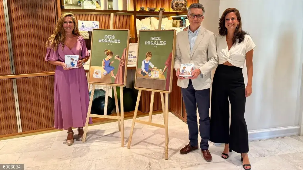
· Las pinturas originales, 16 junio en Sevilla.
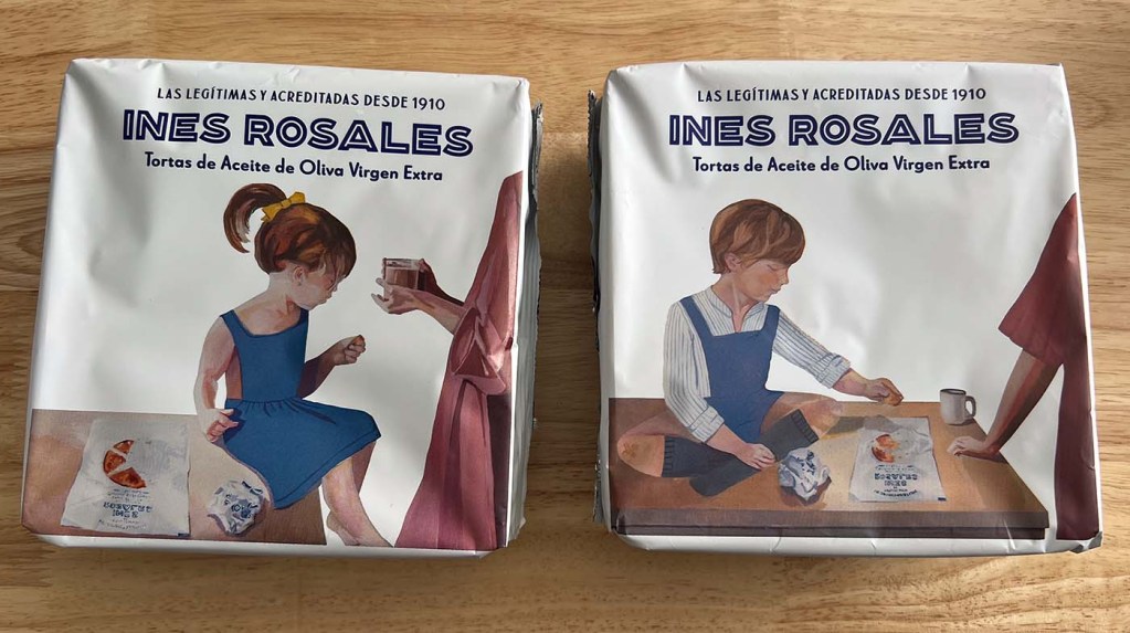
• Vanguardia e innovador. ¿Por qué están sentados en la mesa de la cocina?
Avant garde? More like avant Norman Rockwell to this viewer.
I often forget my questions till I’m on the way home from the doctor’s office. Fortunately they have a patient portal and a doctor who checks in frequently and gets back to me.
Boud.
Boud:
Very disappointed in their selection. The artist has done some very nice work although I don’t know if her style fits food packaging. But these two, from what I’ve seen, are her weakest works. My doctor will be phoning me next week some time. I have to check the patient portal. My previous specialist here gave me an email address to write to him directly.
Hahahahaha, Boud is right — “avant Norman Rockwell.” The images may be designed to appeal to nostalgia for childhood but there’s nothing avant garde or cutting edge about that.
Debra:
I don’t get the selection at all. She’s a good artist, too, but I really don’t like these. But not everything translates to food packaging.
I love old ,nostalgic vintage marketing and packaging on items. It always reminds me of when I was in my youth.
Who was he? Jx
Mistress Borghese:
I love vintage campaigns, too. These don’t cut it for me.
At least the boy is balanced on the table. The girl looks like she’ll fall off at any moment. You’ve never place a child on a table like that girl.
Karen:
You’re so right about her position. She’d already be on the floor.
They don’t do it for me, either. Children with no eyes, sitting on a dining table that people are supposed to eat off? I don’t think that’s a great way to sell a cracker, tbh.
However, I will at some time need to check out one of our swankier supermarkets, Waitrose, to see if they stock them so I can find out what the fuss is about! Jx
One of the things I never understand is supermarket trolleys, where people with babies and small children put them in the child seats, then other people without children, later put their handbags, coats, stuff where babies in nappies have sat…. !
Karen:
Ha! I never thought of that and would hope there’s plenty of protection between the interior of the nappy and the seat. But, I have thought about seating a child in that filthy trolly without a good wipe-down (of the trolley). I’ve seen people clean the handle and the seat with wet wipes.
Jon:
Our recommendation is the “Original” but others have really liked the different flavors.
Is the arm appearing out of nowhere supposed to be Irma’s?
wickedhamster:
Even if it’s a retro image from the ’50s or ’60s, Irma would have been long dead. (So, I hope not.)
Oooooo! Now that would be creepy. A desiccated Ida Rosen rising from the grave to stalk the night putting little children on tables and feeding them strange magical tortas. Makes for a nicely Poe-esque short story.
Maybe it’s just me, but it looks like Mama is ready throw hot chocolate at that little girl.
Bob:
Just strange all ´round.
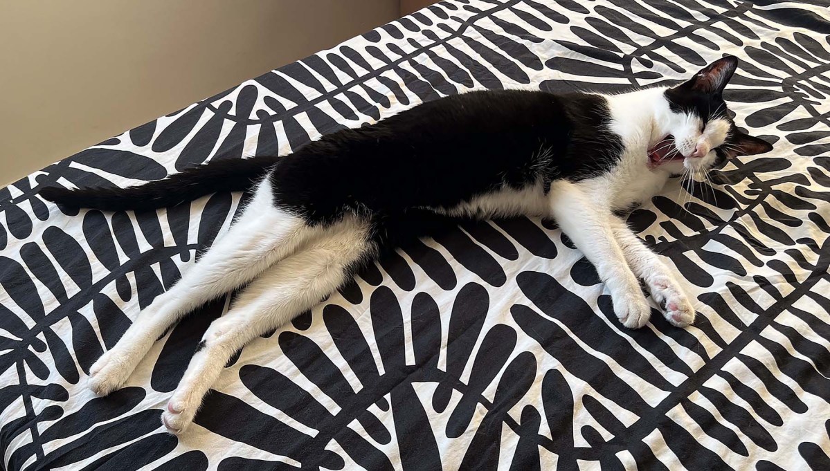
I want to stroke that kitty. (it’s Dudo, right??)
Kelly:
Yes, it’s Dudo. An instant before, he was sound asleep, stretched as long as he could get, and his rear legs were crossed.
Dudo is on my Ikea duvet cover. It would be a good idea to take SG with you. I find another set of ears helps in the doctors office. My brain seems to go numb on those occasions.
Claudia Black:
IKEA has some great patterns sometimes! And they go well with Dudo and Moose. I’ll bet your cover is ironed! Yes, it would be better to have SG’s ears along for back-up.
Yawning kitty on black and white duvet cover is really all that Ines Rosales needed, to draw in everyone. 🙂
Anonymous:
And it wouldn’t be any less inappropriate than the kids on the table with the shadowy adult figure (and the awful composition).
Those children look kind of creepy. I bet if they looked up their eyes would glow like the kids in The Village of the Damned.
Kirk:
I agree completely!
Is a puzzlement.
Walt the Fourth:
It sure is.. Shall we dance one two three?
Clearly inspired by nostalgia, but yeah, I wouldn’t call them avant-garde or cutting edge. It’s weird that they’re sitting on the table but at least they have their shoes off!
Steve:
I don’t know why the images annoy me so much.